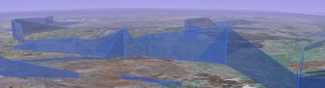
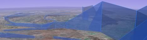
Two great innovations in one network link. A developer at Australia’s Water Resources Observation Network (WRON) has made a visualization of stream flow data for the Murray-Darling river basin. Here’s what’s so great about it:
- Stream flow data is shown via height.
- The network link returns a self-updating time-sequence of monthly data. Effectively, you get animated data on demand.
How does the on-demand animation work? It looks like the original downloaded file contains a dynamically generated random unique ID in the network link’s query URL, which allows the server to keep tabs on who’s been shown what. If you stop the automatic refreshing, the server resets itself after a while, discarding your unique ID. The next time the same network link queries the server, your “new” ID is presented to the server, and the animation starts from scratch.
One way to improve the visuals would be for the polynomials to follow the rivers more closely — with height data interpolated from the nearest actual data points. Still, this is a lovely, creative effort.

the link is missing?:
http://bbs.keyhole.com/ubb/showflat.php?Cat=0&Number=492864
Hmm, yes, adding a link is very blogging 101. Shame on me. Fixed.