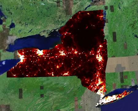
When it rains, it pours. Juice Analytics publishes a glorious example of the kind of stuff spatial analysis does best — overlays for Google Earth with colors denoting population densities or median ages, county-by-county. Here is NY population densities (I love this):
Collect all 50 states.
[Update 23:28 UTC: Forgot to mention that male/female ratios are also available.]
for show to see all the world
Where can I find a hight distrubution of the male population in the USA? Like how tall is a male at the 98 percentile in the US? Thank you to any help. I have made no progress on my own. Harald Duell
Thanks for sharing this. I agree – the Juice Analytics stuff really got me thinking. I am experimenting with Ruby scripts to parse Census data files and generate KMLs to display Census data. I think height is an interesting dimension – and combined with the many different geographic-levels available, there is quite a bit of power in these tools. You can see my progress here.